lightroom

My Damn DAM Process

My Damn DAM

My DAM is a mess.

For many photographers, going into depth on digital asset management (DAM) can be good and bad. Good, because sometimes it’s interesting to know how other photographers manager their photos. Bad, because – well, maybe we should be concentrating on something else.

For me, especially lately, my system has been really crazy. In short, here’s how I do things now:

  1. Load my photos from my card reader into Lightroom as DNG files, organized by date
  2. Go through and mark my favorites, and process them
  3. Export the processed photos as high-quality JPGs into dated folders on an external drive
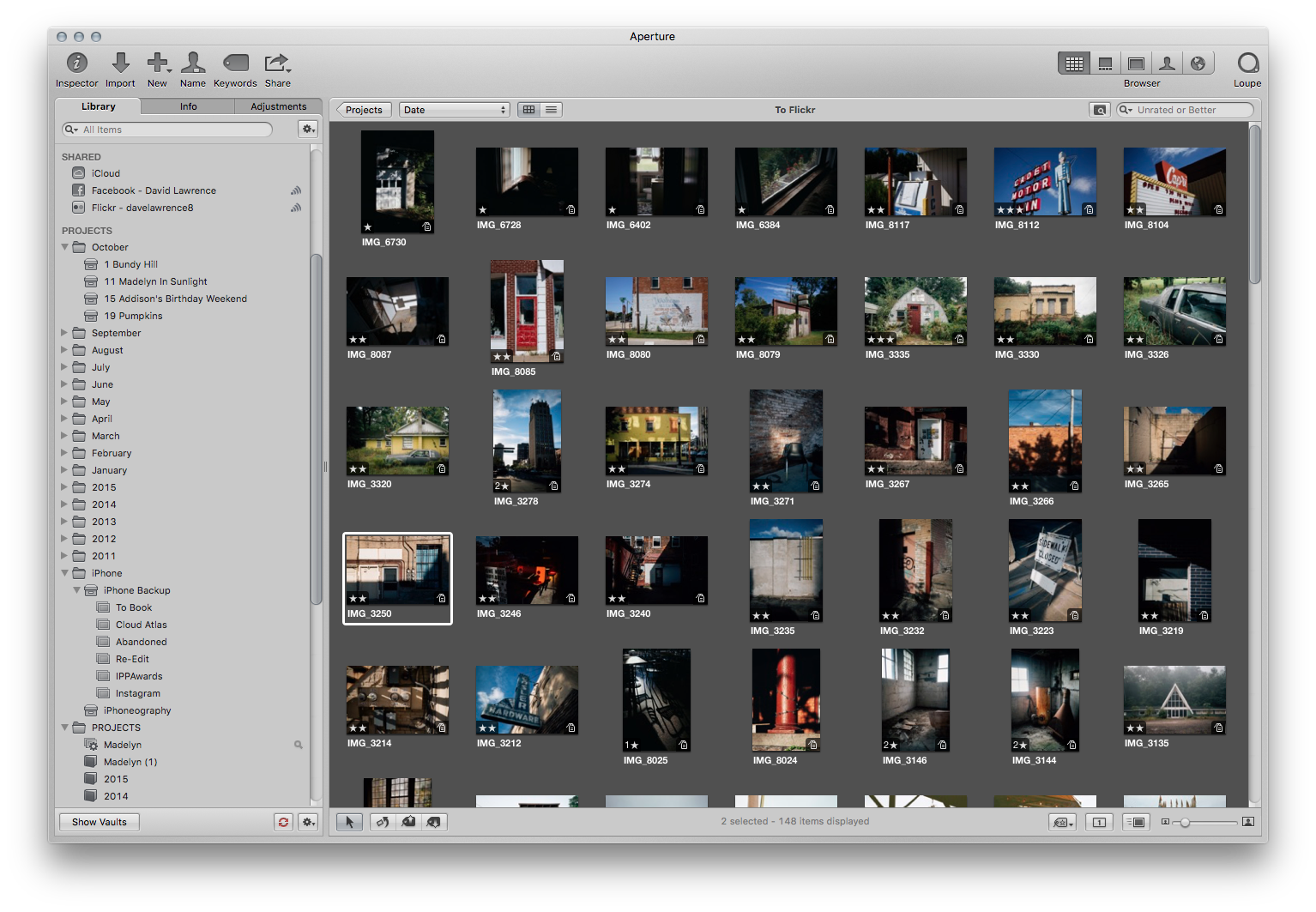
  4. Load those JPGs into Aperture, tag them, get the metadata right, and organize them by months and days, by year.

From Aperture, I take those photos and send them everywhere else: Flickr, Facebook, photo books, calendars, etc. But before they get to Aperture, my photos are filtered and sorted two different ways.

Why not just keep them in Lightroom? I like Apertures metadata handling, organizational scheme, and export options better (here’s my setup). It works like I like to work.

Why not just start in Aperture? Because I like Lightroom’s post processing setup way better, including using VSCO for editing.

For a long time, this setup has worked surprisingly well. One place to process photos, one place to organize and create print projects with them. Except last week when I went to print a photo book of my daughter:

bonk!

Bonk! Aperture no longer lets you print photo books or calendars (this after I had done all the hard work already).

So why use Aperture anymore if one of the main benefits has vanished? Good question – one I’m wrestling with. If all that’s left is Aperture’s superior organization methods, then a switch to Lightroom means relearning my tag management and organizational strategy. Plus I have photos in Aperture that do not live in Lightroom, like from my iPhone. All those will have to get moved over and sorted.

When I want to make a photo book, I’ll have to either import photos in Apple’s Photos app on the Mac, or stick with Lightroom and create photo books in there, probably through Blurb. My Flickr setup will have to change. And I’ll have a bunch of tagging and sorting to do.

My plan, so far as I’ve thought about it, is this: continue to use Aperture through the end of the holidays, and use the time in between to slowly migrate my system to a Lightroom-only DAM philosophy.

Aperture was a great program while it lasted. Now that it’s officially on life support, it’s probably time for me to rethink my damn DAM strategy.


Portrait Editing in Lightroom

Just for fun, here’s a behind-the-scenes portrait editing session in Lightroom I put together using a photo from my Artists In Jackson project, featuring painter Colleen Peterson.

This is a simplified editing process, but I don’t spend a ton of time on each photo. I have my process down pretty well.

Contrast, exposure, sharpening, and VSCO. Just that simple.

Enjoy!


On Processing Photos

I did this a while back on portraits, but here’s a little behind-the-scenes on how I process my photos in Lightroom.

Let’s take a photo from the Heidelberg Project in Detroit – blending a few favorite subjects of mine: an abandoned house, public art in an urban setting, good mix of light and deep shadows.

Here’s a before and after. The photo was captured with a Canon 7D and 24-70mm f/2.8 Sigma lens. The framing of the brick pillar and the burned black ceiling, with the shaft of light streaming down the stairs, made for an interesting scene.

I start with exposure. Is the frame too dark? Too bright? How about white balance. After adjusting those in Lightroom, I pick my VSCO present. These days, it’s Film 05′s Kodak Ektar 100. That particular film setting has a lot of options, but I usually stick with the default, or play with the Contrast+ setting.

I like Ektar because of its high-contrast, green-tinted-shadows look. It’s not afraid to let the shadows go completely to black, and it’s a warmer film tone. But that’s just the start.

From there I’ll probably add a bit more punch in the contrast setting, drop the highlights a bit to let more detail in the bright spots, and drop the blacks down to give it that really contrasty look. Shadows are my friend.

Depending on the image, I’ll also reduce the saturation a bit. Adding contrast makes the colors pop a bit too much for my liking (those shoes might be a bit too blue for my taste).

Increase the sharpening a tad (usually to the 30 mark, with some masking to only sharpen the edges), maybe bump the clarity (only for non-people photos), and increase the color noise reduction if I have to. Peeking at the shadows and dark spots in the photos lets me know if there is color noise.

Hit the “Remove Chromatic Aberration” toggle if I need to, and do any kind of lens or perspective corrections if I have to. And then I’ll add a bit of a vignette and, especially for VSCO film packs, reduce the grain level. My settings rarely have grain going anywhere above 20-30.

As a last touch, I’ll sharpen little details with the adjustment brush, spot remove anything that seems out of place, and crop a bit.

That’s it. Nothing complicated or fussy. I’ll spend a very short amount of time on a photo, and bring it into Photoshop to do any kind of heavy lifting. Getting it most of the way there in camera is the important part, allowing me to make the styling adjustments as needed.

Questions? Give me a shout.


A Good Haul

A typical lineup of abandoned photos from one house, in one afternoon.

Two stars for the keepers, and then I get to editing. There were about 70 total photos from this particular abandoned house. From there I narrow it down to about 30 keepers. Only about 5-10 of the remaining 30 will ever appear in public, but hey, I like processing. What the film guys got out of the darkroom, I get with Lightroom.

I may wait a while and comb through them one more time. Given some distance, I’ll catch things that I missed before, or have second thoughts about a so-so photo.

A good haul. Lots of great shadows and light shafts.


Reader Question on Style

Hello Dave. I just recently created an account on Tumblr and stumbling through different photography blogs I’ve noticed that many people post pictures that have a certain style to them, one I haven’t really seen before. The style I would be referring to I noticed in your pictures “Sunrise on the Mill Pond – Concord, Michigan” and “Catching the Dew – Albion, Michigan”. I was just curious as to how you achieve this look, if it is achieved through Ps or Lr, or if it depends on the type of camera.

Those two (catching dew, and the sunrise photo) are two of my favs from the fall, and really a product of the right time of year, the right sunrises, and a healthy dose of custom VSCO editing in Lightroom. The macro lens helped, too, to really get in there and capture the details on the dew shot. And don’t quote me, but I think I used VSCO Film 03 for both. Thanks!


Creating Lightroom Presets

Argus

Messed around making my own Lightroom preset, after seeing these images from the Kage Collective.

I’m not into the whole matte black, faux-film look so much, but there is a trendy appeal to it. And I’m usually Mr. Bright Colors guy, but something a little more soft and restrained is good for variety. I made a black and white version, too, just for fun.

This isn’t all that different from the stuff you see sold for $20-50 a pop nowadays. But dig in to a preset you like and you’ll learn enough to be dangerous, and start making your own.

Strong vignettes FTW!