film emulation

Canassic Chrome

Classic Chrome Film Emulation on Canon Cameras

Fujifilm cameras are famous for their film simulations that give images a unique character straight out of the camera.

One of the most beloved of these is Classic Chrome, known for its subtle tones, soft contrast, and cinematic feel.

But what if you shoot Canon? Good news: as I’ve talked about before with film emulations like Kodachrome and T-Max, you can get surprisingly close to that Fujifilm look with Canon’s Picture Style system.

Fuji’s Classic Chrome is all about restraint. It tones down saturation, especially in reds and blues, creating a muted, documentary-style color palette. Shadows lean slightly cool, highlights stay gentle, and the overall feel is understated – with a little touch of pink/magenta in bright spots. Think: vintage travel magazines or classic street photography.

And honestly, it’s very different from my own high-contrast, deep-saturation look. However, thanks to this Canassic Chrome (Canon + Classic = Canassic) emulation, we Canon users can achieve a similar look to that of Fuji using Picture Styles.

Here’s a quick comparison: my edit on the left, Canassic Chrome on the right:

I prefer my shadows to be black and my colors to pop (left). Classic Chrome (right) is different, a bit softer, and I took a chance on it during a recent trip to Lisbon, Portugal.

Canassic chrome in portugal

On our anniversary trip to Lisbon, Portugal, I loaded my Canon EOS M6 with Canassic Chrome to give it a spin. 

What made this trip great was the variety of weather conditions. We saw sunny beach scenes, rainy and foggy hilltops, ocean cliffs, sea-side sunsets, and the contrasty urban environment of old town Lisbon. 

Above, it shows its subtle tones and desaturated look on the beach at Costa De Caparica, Portugal.

I’ll have more to share on our Portugal trip, but throughout this Canassic Chrome discussion, you’ll see photos from the M6 that show what Canassic Chrome can do.

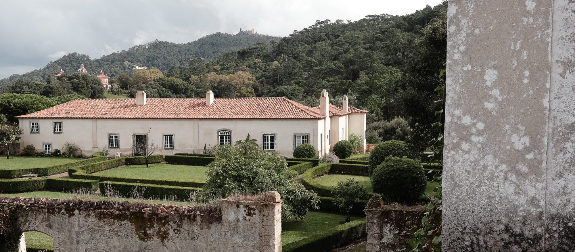
Above, I try Canassic Chrome on a rainy, foggy day in Sintra, exploring the colorful palaces and green hillsides.

Adding a touch of warmth by using Canon’s cloudy white balance was maybe a bit too much – but that’s what the experiment is for.

Here, I took Canassic Chrome for a test drive on the beaches of Costa de Caparica, close to sunset, to capture the soft, golden hour tones of the Atlantic coast.

These show the slight pink and magenta cast the Picture Style offers. It’s definitely a unique look. 

WHere to get canassic chrome, and how to install it

  • Initially, you could grab Canassic Chrome from a site called Canon Style. Their YouTube channel remains, but the site is no longer available.
  • Thankfully, you can grab the Picture Style from Anh Hàng Xóm on Gumroad (I threw $1 at him, just to say “thanks”)
  • Once you have downloaded the PF3 file, follow these steps to install it on your Canon camera. 
  • Set your camera to shoot either JPG only or JPG + RAW, and select the Picture Style to have your camera save a Chrome JPG.
  • Go out and find something to photograph to test it out.

Above are some scenes from around Old Town Lisbon – bright and sunny, showing that Canassic Chrome can be a versatile film emulation that I found flexible enough to both fit my style and provide a unique look to these pictures.

How to create your “Classic Chrome-style” Picture profile file

Want to create a Chrome style all your own? Canon’s Picture Styles give you full control over how your JPEGs (and preview images in RAW) render color, contrast, and sharpness. You can tweak existing profiles or load custom ones into your camera using Canon’s Picture Style Editor or third-party styles designed to emulate Fujifilm simulations.

The look to shoot for: muted global saturation (especially red/orange), slightly cool/teal shadows, restrained highlight roll-off, modest contrast in midtones. Overall, a cinematic and documentary feel (quiet, desaturated, moody). Use this as the target when building a Canon Picture Style.

Here’s how to make your own:

  1. Install the Picture Style Editor.

  2. Open either the Faithful setting or the Canassic Chrome as a base style in the editor.

  3. Adjust parameters to your liking:

    • Contrast: –2

    • Saturation: –2

    • Color Tone (or colour tone/hue): slight warm shift (+1)

    • Sharpness: a modest increase (+2)

  4. Save/export the result as a .PF2 (or .PF3 if your camera supports it).

  5. Use EOS Utility (Canon’s camera software) to upload the PF2 to your camera’s custom picture-style slot.

Shooting with THIS Classic chrome Profile

Using a Classic Chrome-style Picture Style lets you capture photos with mood and personality straight out of camera. It can save editing time, help maintain a consistent aesthetic across shoots, and inspire a slower, more intentional approach to composition. Think of it like shooting film.

Coming back from Portugal, using the film emulation definitely saved on editing time. I picked a few selects from the JPGs and shared them on Instagram almost instantly. Since I can wirelessly transfer the photos from my M6 to my phone, it made sharing these photos super easy.

Whether you’re documenting a quiet street corner in Lisbon or chasing soft afternoon light near your own home, bringing a Classic Chrome vibe to your Canon setup is an easy way to infuse your digital pictures with timeless character.

Also, be sure to check out my YouTube video on more Canon film emulations.


Cinematic Color Negative Canon Film Simulation + Steampunk Photos

Steampunk on the Bricks - Dave Lawrence

In my latest YouTube video, I test out several film-like Canon Picture Styles to see which of them can give Canon photographers that Fujifilm-like simulation experience.

Preslav Rachev left a comment asking for feedback on a Picture Style he recently developed, Cinematic Color Negative, and offered it up for a free trial. 

Last weekend, I loaded up Preslav’s filmic emulation onto my Canon M6 and shot for an artist friend of mine at his Steampunk on the Bricks event here in Jackson, Michigan.

Overall? It’s good. I like the colors and contrast – it fits my style of shooting nicely. 

The reds pop, and the greens are muted. That’s just what I’m looking for in my Canon film simulations. And in good lighting, skin tones are natural.

However, testing it out on our new baby niece, and in mixed lighting, the skin tones were a bit overpowering:

Baby Iris

Everyone else’s skin tones looked okay, but poor Baby Iris. She got the neon orange treatment. It could be a combination of jaundice and a reddish skin hue.

The baby is an outlier. For the most part, Preslav’s Cinematic Color Negative Picture Style worked well over a weekend of shooting. 

A few more RAW vs JPG shots for comparison (RAW is on the left):

Cinematic Color Negative - RAW on left, JPG on right

Cinematic Color Negative - RAW on left, JPG on right

My eye notes the subtle desaturation of the greens and blues. The top comparison makes that clear with the plants and the blue sky.

The bottom comparison is a little more subtle: contrast is up, and the house appears whiter in the JPG. Again, the sky in the back loses a bit of blue. Whites are whiter, blacks are blacker – both help increase the contrast.

Head to Gumroad, throw Preslav a buck or two, and try out Cinematic Color Negative yourself (and check out his photography too). 

Thank you, Preslav! 


Canon Picture Styles and Film Simulations

Over the last few months, I’ve spent a lot of time testing Picture Styles – Canon’s version of Fujifilm’s in-camera film emulations.

I’m not typically a JPEG shooter. I prefer to grab my RAW files and edit them in Lightroom, but in a few cases, using film-like simulations was very efficient and convenient. 

In this video, I show the results of those tests and try to explain the benefits of shooting with Picture Styles. It’s also a nice option for those Fuji users if they ever have to pick up a Canon camera and shoot film-like emulations, like their beloved Classic Chrome. Picture Styles don’t have the legacy of Fuji making its own film, but they get you pretty close.

There are two groups of Picture Styles I tested:

Plus a Canassic (Classic) Chrome preset that’s been abandoned.

You can read my individual reviews of these picture styles:

Canon also lets you build your own Picture Styles using the Picture Style Editor software

Which ones have you tried? Any of them work for your style? Let me know in the comments. 


Canon + Kodak T-Max Film Simulation

Canon + Tri-X

Black and white is tough.

You’d think shooting monochrome with only two “colors” – black and white – would be easy. But photographers’ opinions on black and white film and presets are almost as strong and varied as their opinions on camera companies.

Canon’s standard monochrome picture profile setting is…fine. It’s just not special or unique. 

But thanks to the power of custom picture profiles and film simulations, you can get the look of Kodak T-Max film on your digital Canon EOS camera. 

This T-Max film emulation comes from the Vision Wrangler collection – like the previous Kodachrome film style

I took a sunny, spring evening in downtown Jackson, Michigan, to try out this black and white emulation. Maybe it was the lighting, maybe it was the simulation, but this was good stuff. 

For a contrast-y film simulation, this T-Max picture profile was a good walk-around monochrome standard. If you want to shoot JPGs and not worry about editing, this film emulation is reliable and consistent. 

My one suggestion with this profile is to try cranking up the ISO setting on your digital Canon to get more of a filmic grain. 

But the deep blacks and good microcontrast? It’s all here. 

Here’s how to install picture profiles on your own Canon digital camera. 

Shot on the Canon EOS M and EF-M 22mm f/2.


Canon + Kodachrome Film Simulation

Detroit, Michigan street photos

Now this is more my style

I’m aiming to try out the popular film simulations for Canon cameras – like the well-known Fujifilm emulations on the X series cameras. While Canon cameras do not come with film emulations baked in, they are available via Canon’s Picture Style editor and camera profiles. 

This Kodachrome-style film simulation comes from Cinescopophila: a giant pack of 150+ picture styles featuring a ton of favorites – almost too many to practically try out. But seeing Kodachrome on the list, I had to give it a spin on a recent family trip to Detroit.

Unlike the Fujifilm simulation from Thomas Fransson, these Kodak colors are more my vibe: warmer, much better skin tones, and a healthy amount of contrast.

And those reds? They POP. The greens are nice too. There’s none of that washed-out blandness from the Pro Neigh High series.

Overall, this is a reliable film simulation if you’re a JPG shooter or don’t want to worry about editing. Most of these came out correct as-is, with a little tinkering on a few images for exposure and contrast.

Do these photos mimic Kodachrome? Not really. But for my style of shooting, and even some video, these are a good film-like preset to get you started. With a bit of adjusting, you can get this slide film emulation looking just the way you want. 

There are plenty of other Kodachrome versions to try, although many come at a cost. This picture style from Vision Wrangler comes with 150 more to try, with everything from wacky out-there stuff to tried-and-true black and white film emulations.


Canon + Kodak Film Styles

Fujifilm X cameras are known for their film simulations. Fuji owns and creates several film stocks, so it only makes sense that they build those film emulations into their family of cameras.

As a Kodak film user, however, there’s nothing like Fuji’s film emulations for other cameras – like my own, preferred Canon lineup.

That’s why it was great to learn that Canon’s own Picture Style options can be adapted to loosely match other film stocks out there. With that, I learned Thomas Fransson had created a series of Kodak film styles for Canon cameras. In this case, I downloaded Thomas’s Crowdak film simulation and applied it to a Canon M6 with an EF-M 28mm lense for a quick test.

Some initial thoughts:

  • With lots of greens and blues on my quick walk during my lunch hour, it was hard to see how the film simulation captured other colors and lighting conditions
  • Overall, very muted colors – more than I’m used to with my own style
  • Contrast was almost perfect for my style of shooting

I’m eager to try out Thomas’s other film styles, and several more from Cinescopophilia